Of New Banknote Designs and Philippine Map Errors
Dec 20 2010 Mon
12:50 am PHT
I was excited to see the new peso banknote designs that the Bangko Sentral ng Pilipinas unveiled this month and like many other people, I approve of the general graphic design as well as the inclusion of Cory Aquino on the 500-peso bill (a very popular request ever since the former President passed away). I also very much like the unified theme of featuring (mostly) natural tourist spots, fabric designs, and (mostly) endemic fauna on the back of the banknotes.
However, the BSP committed some grave errors. The first to be pointed out by many people was the incorrect typography of the species names—the scientific name should have been italicized and the first letter of the genus should have been in uppercase with the rest of the letters all in lowercase.
A more grievous error (in my opinion) are the errors in geography. (Well, what do you expect from a map geek? Hehehe.) As I blogged years ago, a personal pet peeve of mine are inaccurate maps, and the new banknote designs, with their incorporation of a map of the Philippines on the reverse side showing the locations of the tourist spots, have a few of them.
I was planning to write a blog post analyzing the errors, but New Media Philippines has already done it and the issue has even been highlighted in GMANews.TV. So I will no longer push through with my plan since I really have nothing substantial to add.
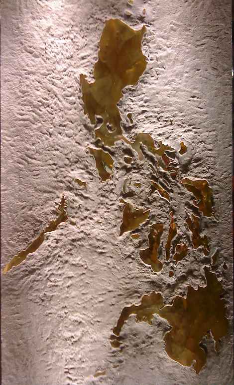
What I’ll do instead is to do a pop quiz. Shown below is a photo of part of a store display in the Rockwell Power Plant Mall depicting a map of the Philippines made from cut-out metal sheets. For the most part, the archipelago is quite correct in both its shape and placement (although Palawan seems to have shrunk a bit). However, I quickly spotted a glaring error. Can you find what it is?

Comments
Comments are currently disabled.